
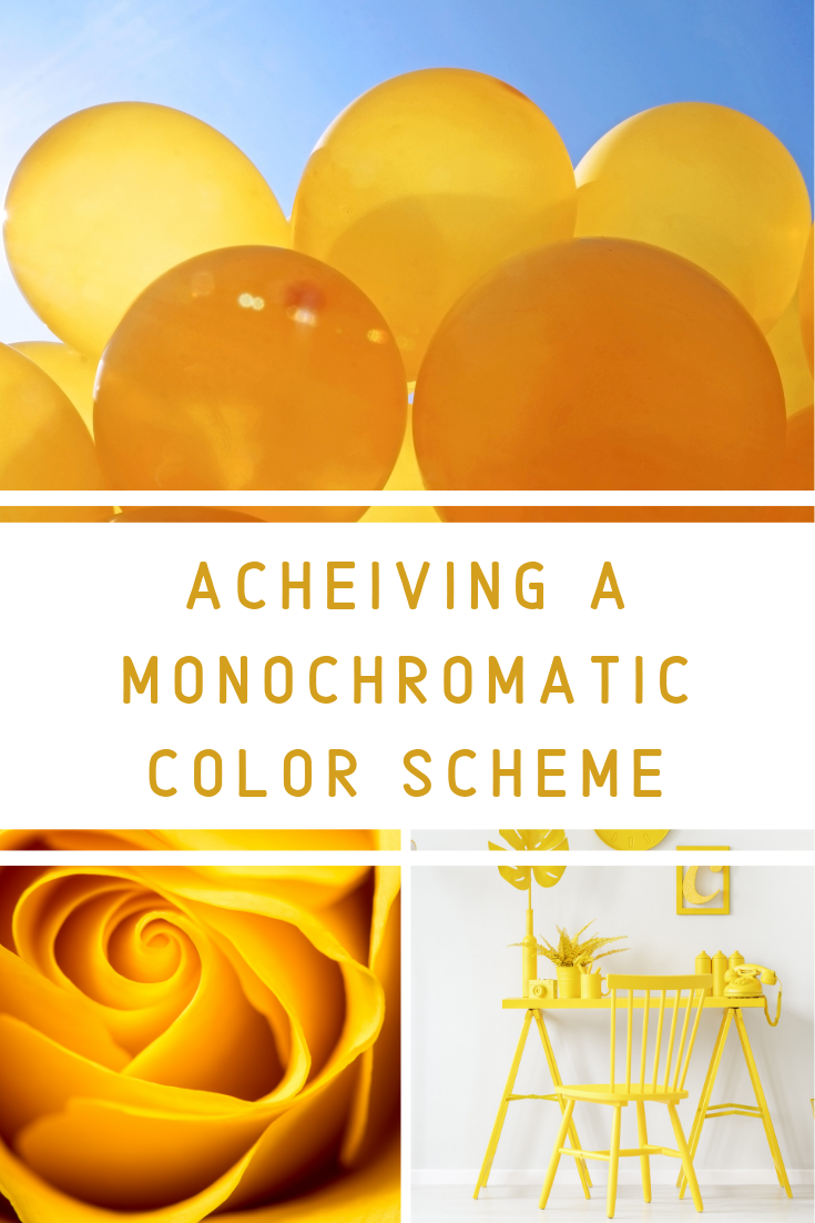
How to successfully achieve a monochromatic color scheme
Monochromatic color schemes, like any other color scheme, can be as bold or subtle as you choose. To keep your fashions and interiors interesting, regardless of your desired color palette and personal style, there are a few tips to keep in mind when choosing a monochromatic color scheme.
A few terms to help you understand monochromatic color schemes.
Hue- the color name; example hue red. (More hue examples: yellow, blue, green, purple.) The colors found between these on the color wheel are known as hue families. Examples include: red-yellow, yellow-green, blue-green,blue-purple, red-purple.
Value- the lightness or darkness of the hue. This is where you will see lighter and darker variations of the color. The lightness and darkness is created by adding various amounts of white, greys and black.
Chroma or intensity- the amount of pure chroma in a given hue; relative to brightness versus dullness. The normal value is when a hue occurs naturally without any addition of color. Brighter hues, like yellow, tend to have more brighter colors than dark since the color is naturally lighter. Example: you tend to see more light yellows than dark yellows. Hues that are naturally darker, like purple, tend to have more dark options than light.
Reference: Nielson, Karla J., and David A. Taylor. Interiors An Introduction. 4th ed., McGraw-Hill, 2007
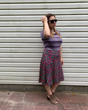
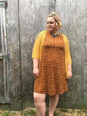
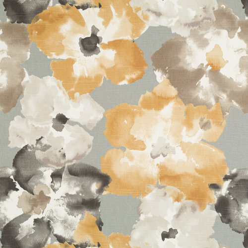
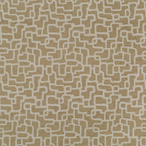
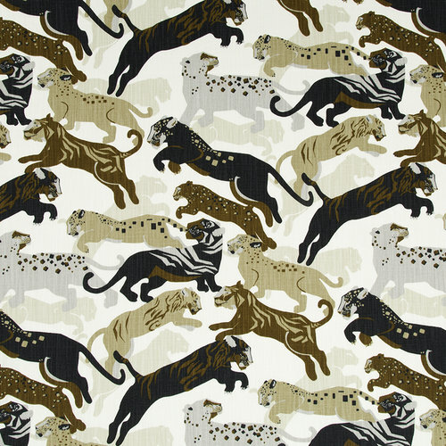
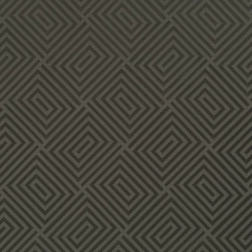
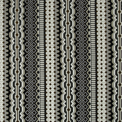
Pattern Play: Mixing patterns is a great way to keep a monochromatic color scheme more playful or visually interesting. You can make as much impact as you’d like. When mixing patterns I always suggest a common color to unify the scheme. This is easily achieved when you are using a monochromatic palette. The scale of your patterns is important. I like to use a minimum of 3 patterns when mixing. You will want to find a small, medium and large scaled pattern.

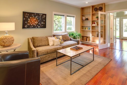
The accessories in this room are a great example of using a monochromatic color scheme. The varied shades of blue paired with the various textures offer a balanced space that is visually interesting.
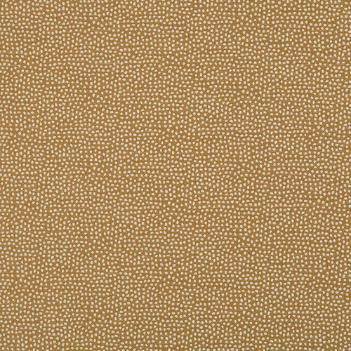
Visual Dimension: Also known as texture, is a great way to break up a monochromatic color scheme. The added third dimension of a textured fabric offers depth and interest giving a fabric it’s visual appeal. Leather, velvet, linen, satin and sheer fabrics (to name a few) can add texture and interest to both outfits and interiors.

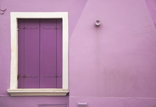
This is a great example of a monochromatic room offering various textures throughout the space to create visual interest in this dominantly pink space.
Your monochromatic fashions and interiors will be anything but mundane if you work in some pattern and texture using the tips above.
Stay fabulous,
Jen

Want to learn more about color schemes and how to use them in fashion and interiors? Click the link for a free guide on color basics.